Spot.
Helping pet owners gain easier access to veterinary advice in order to improve pets’ longterm health.
WHAT I DID
user research
ux/ui
Branding
PROJECT CONTEXT
For the love of fur.
According to the latest national survey, 60% of households in Canada own at least one pet – perhaps not surprising given that pets can provide many benefits for their owners’ health...but what about their own health?


THE PROBLEM
What?
More pet, less vet.
The number of pet owners bringing their pets for regular checkups in North America is decreasing*, leading to more adverse outcomes for their pets’ long term health.
*Sources: AVMA / Bayer veterinary care usage study

Why?
The main reasons cited for this decrease are:
High veterinary costs
1
Geographical & transportation barriers to access
2
Lack of perceived value for money
3
THE GOAL
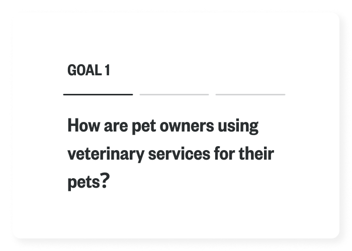
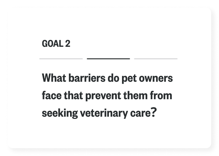
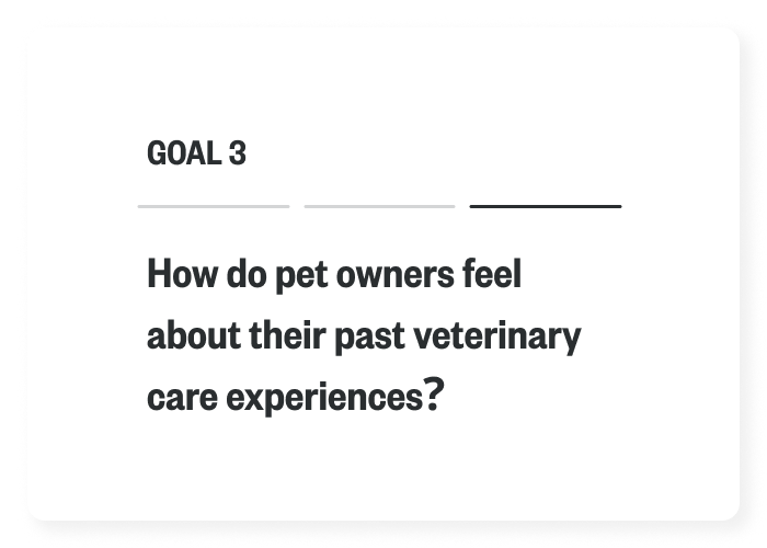
Learning the Landscape
I set out to understand what the main barriers preventing owners from seeking healthcare for their pets are, so that I could create a more convenient and accessible way for them to do so.
Understanding the Audience
PERSONAS
In order to ensure the user was kept front of mind throughout the research process, I created 2 primary personas that encompassed the wants and needs of our target pet owner. Having their goals and current challenges clearly outlined allowed me to continually refer back to them to ensure both the research and proposed solutions were firmly aligned with their needs.


THE APPROACH
Research Methods
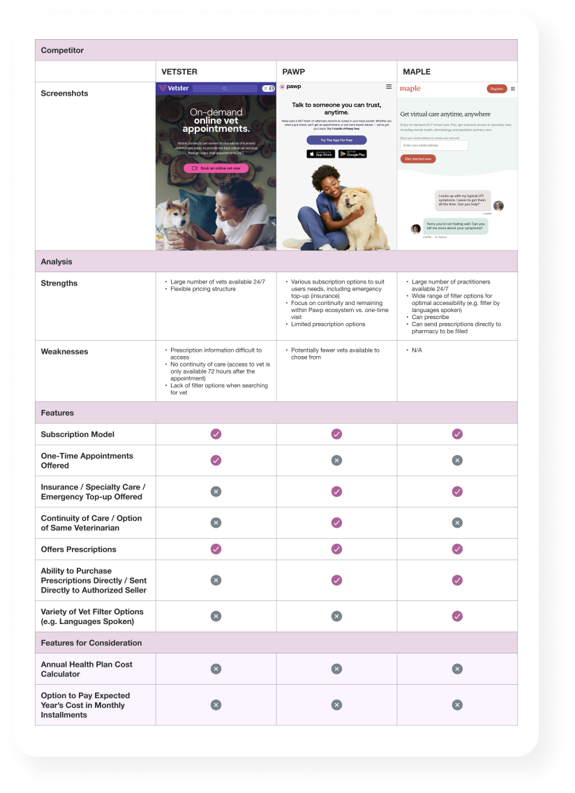
1. Competive Analysis & User Demographics
After establishing the user personas, the next step was to conduct a competitive analysis in order to get a sense of the existing competitors within the pet healthcare space. I was careful to also include out-of-category digital products whose insights and features could potentially apply to my own explorations.

2. User Interviews
The next step was to interview users in order to form a deeper understanding of their needs and goals, and to empathize with the challenges they were currently facing. The data gained from these interviews was instrumental in establishing what users needed and/or felt was lacking when it came to accessing vet care for their pets.
INTERVIEWEE 1
“Living in the countryside means I only take my dog to the vet if I think it’s very serious…mainly because of the inconvenience of it.”
-Julie, rural pet ownerINTERVIEWEE 2
“My pet has breed-specific issues, and not all vets are as knowledgable about those unique issues as others.”
-CLAUDINE, BULLDOG ownerINTERVIEWEE 3
“As a vet, I see a lot of pets ending up in ER’s for non-urgent issues, simply because they can’t get a regular appointment for weeks.”
-jess, er veterinarianINTERVIEWEE 4
“I don’t like to waste my time and potentially the vet’s time for a full appointment if it’s just a minor issue or question.”
-david, urban pet owner3. Affinity Mapping
After completing the user interviews, I analyzed the transcripts and made note of each user’s unique insights and goals. I then bucketed these under 4 main themes, which seemed to re-occur throughout the interviews.
The key themes identified through this exercise were:
The In-Person Vet Experience
Accessing Vet Care
Personal Preferences
Costs

How Might We’s
Finally, before moving into ideation, I distilled all of my collected observations and insights into 2 succinct HMW statements. These statements would help define and anchor any proposed solutions in the key problems my users were facing.
HMW STATEMENT 1
How might we help make accessing veterinary advice more convenient for busy pet owners in order to improve their pets’ longterm health?
HMW STATEMENT 2
How might we help rurally-located or travelling pet owners to obtain peace of mind by having easier access to veterinary advice remotely?
THE SOLUTION
Ideating
Armed with a solid understanding of the problem at hand, it was time to start ideating on potential solutions. Some quick storyboarding exercises helped to put myself in the users’ shoes and map their journey.
Storyboarding

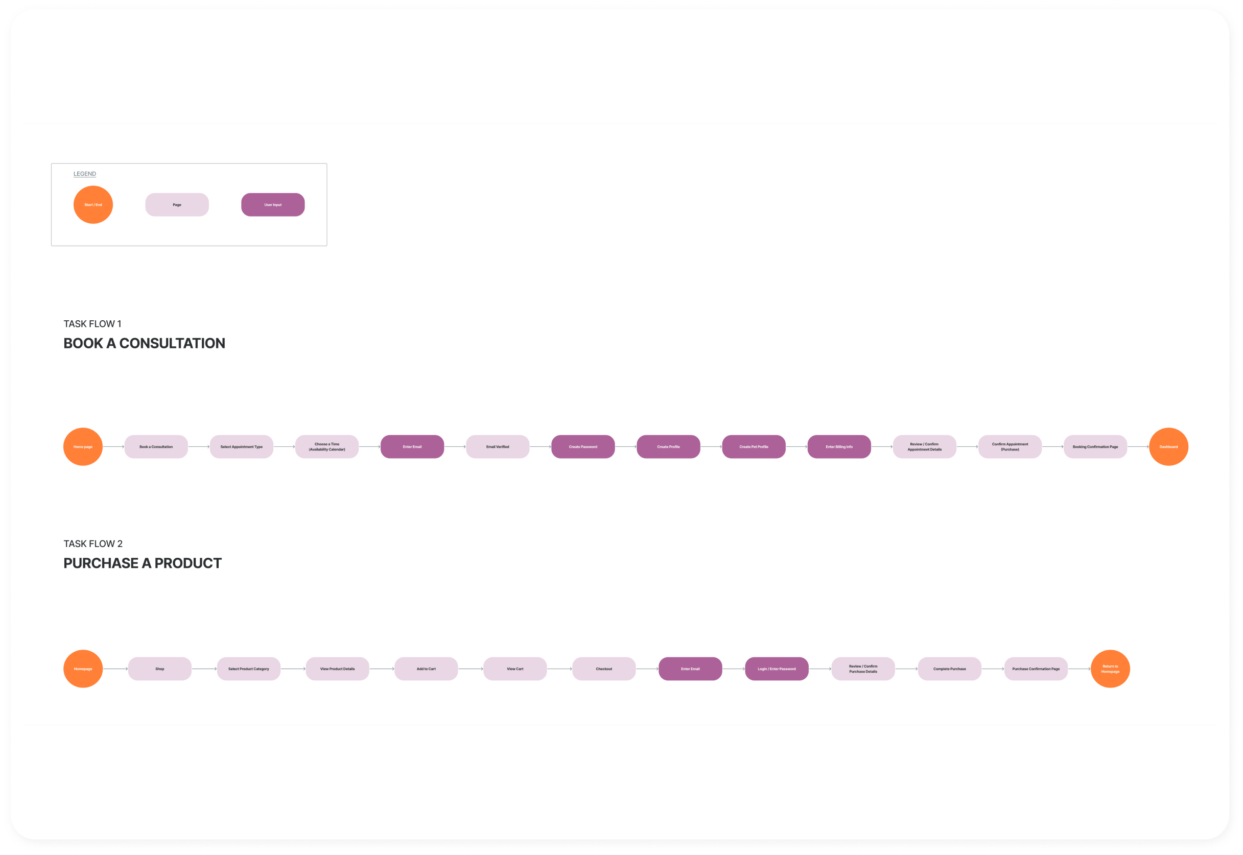
Task Flows
Next, I continued to flesh out the user journey by sketching both User and Task Flows for several different potential tasks the user may try to accomplish. Doing this helped decide which tasks to prioritize when it came time to start sketching low-fidelity wireframes.
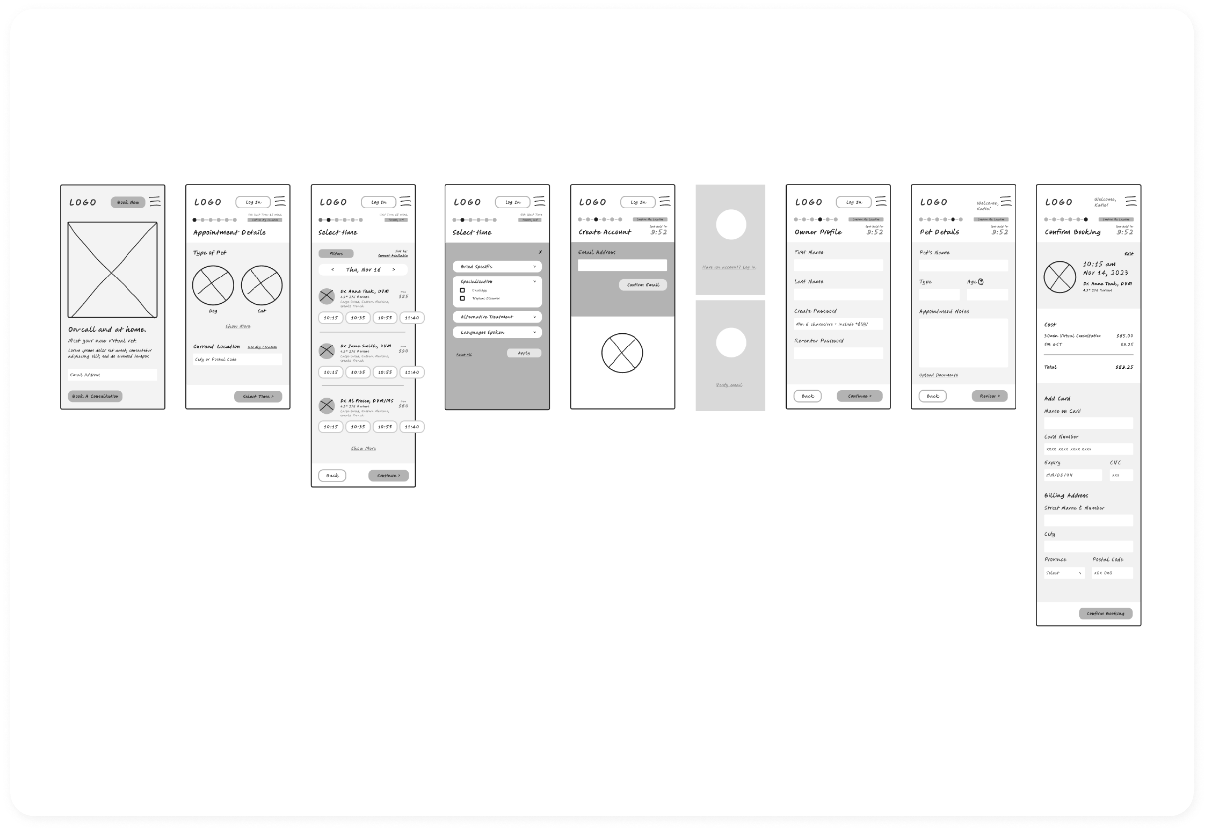
Lo-Fi Wireframes
Having decided to start by designing the booking flow, I sketched out several iterations for how each screen could look and function before moving on to mid and finally high-fidelity wireframes.
Creating an Identity
BRANDING
Given the brand’s focus on innovation and skill, a simple, refined wordmark felt like the right approach to convey these values. The custom rounded letterforms do the work to impart a subtle message of playfulness within the name itself, keeping things clean and simple.
BRAND VALUES
Innovative
Progressive
Accessible
Compassionate
Skilled


I created a palette that felt fresh and slightly disruptive within the healthcare space, which aligns with the brand values of being progressive and innovative. The warm colours tie in with the compassionate and accessible aspects of the brand.


Putting It To The Test
USER TESTING
Now that all the pieces were in place, it was time to test it with real users to see what was working, and what could be improved upon.
Users were asked to complete 2 tasks:
TASK #2
Create an account and pay for your booking.
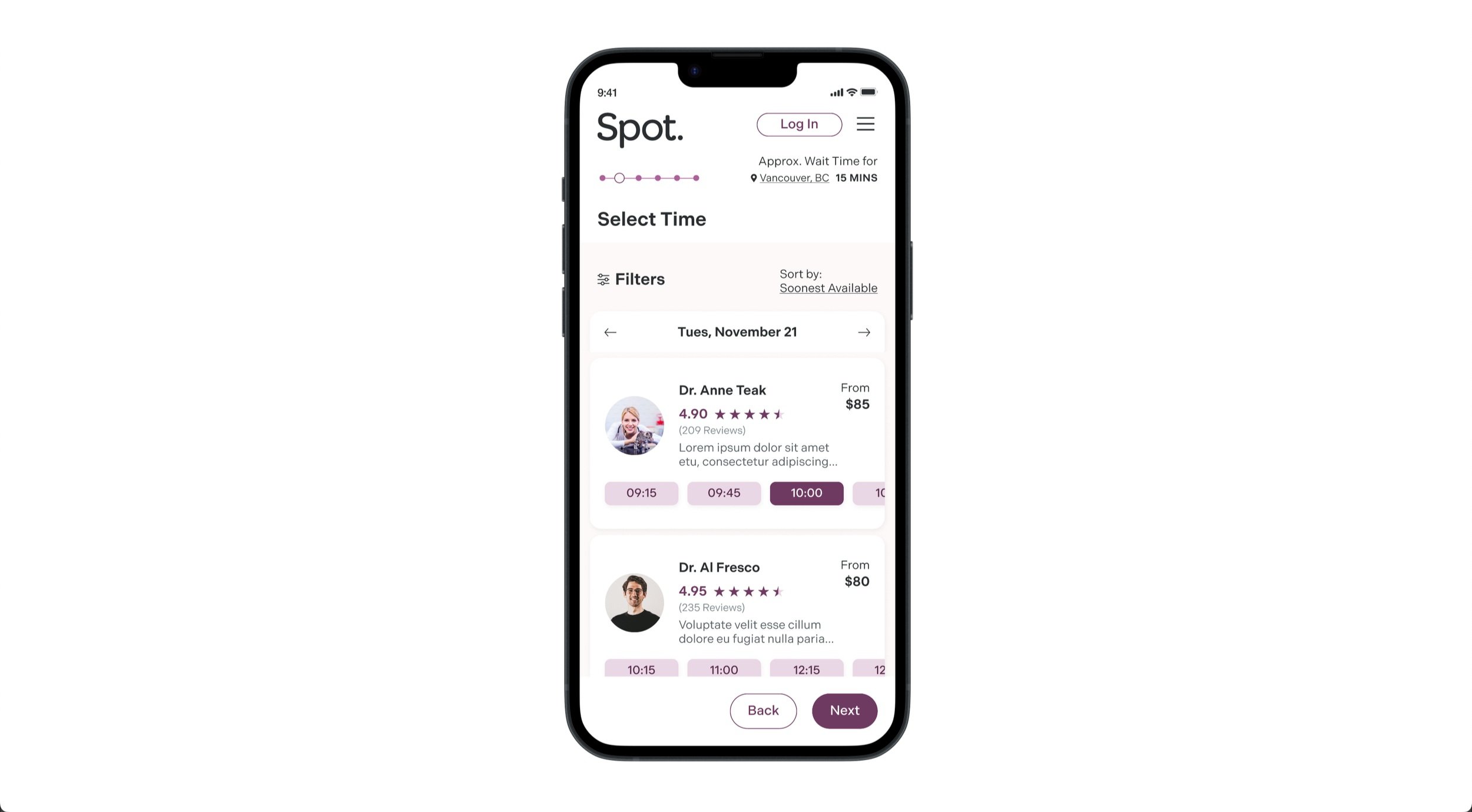
TASK #1
Select an appointment time for your small breed dog with Dr. Anne Teak.
Users were asked the following question:
“Overall, how easy did you find this task to complete, and how obvious was it where to find the information you were looking for?”
Listening + Learning
TASK #2
4/5
from 5 partipantsTASK #1
5/5
from 5 partipantsThey were also asked to provide any additional feedback regarding what they felt could be improved.

Some users commented that they would like the user reviews / vet rating to be more visible

Some users did not scroll down to reveal additional payment options, assuming Apple Pay was the only option available.
Refine, Refine, Refine
Drawing on the feedback received, I was able to make changes to the 2 screens that added clarity and improved the user experience.
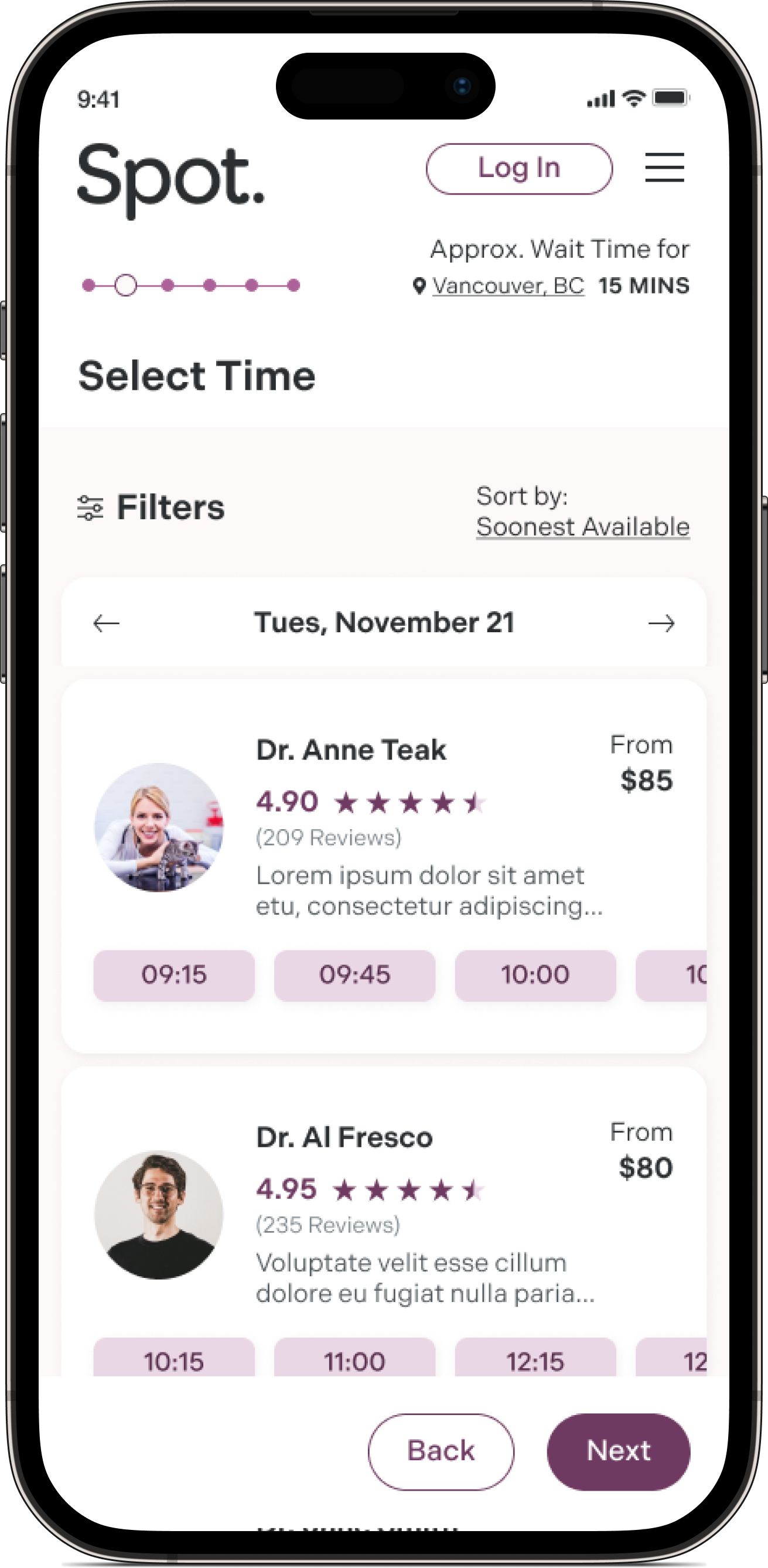
Stars were added to correspond with the numbered rating, providing an additional visual cue and better accessibility
I iterated on new layouts for the pay screen before settling on having 2 buttons displayed above the fold.