Opal Electric
Helping a highly skilled, reliable electrical company build relationships with top quality home builders in order to ensure successful project outcomes.
WHAT I DID
user research
user testing
ux/ui
web design
Branding
PROJECT CONTEXT
A Gem of a Small Business
Opal electric is a small, owner-operated business in Edmonton, Canada, employing 5 local electricians. Founded in 2006, they are a well-established, trusted company with a reputation for being great to work with.
THE PROBLEM
In with the new (goals).
Like many owner-operated businesses, Opal electric started small, relying on word-of-mouth referrals and a simple website. However, their business goals have shifted in the years since creating their website, and as a result, their content and design is no longer optimized for their target users’ needs. Many of the users they hope to attract would struggle to find or access the info they need once they come to their site.
Refresh for Success
THE GOAL
I set out to understand how users were making decisions around which electrical companies they hired, and what information they were looking for in order to help them make those decisions.
RESEARCH OBJECTIVE #1
How are users finding prospective electrical companies?
RESEARCH OBJECTIVE #2
How are users making decisions regarding which electrical company to hire?
RESEARCH OBJECTIVE #3
What are users’ biggest concerns when looking to hire an electrician or subtrade?
THE APPROACH
Research Methods
Methods Used:
Competitor Analysis
User Interviews
Affinity Mapping
After establishing what I needed to learn, I then created a research plan outlining the methods I would use to gather those insights. While this project could be viewed as relatively straightforward – a “simple” website – by grounding the design in the user’s needs, I would be able to make it much more impactful for the user, and consequently for the business owner.
1. Competitor Analysis
The first step in my research was to conduct a competitor analysis, looking at both the design and visuals of a number of local competitors.* From this I was able to uncover some common patterns across the industry, and opportunities to optimize the new website’s content and design in order to have it stand.

*Actual business names and images blurred for confidentiality
2. User Interviews
Next, it was time to talk to real users – builders and designers – in order to gain a deeper understanding of their needs and goals. The insights gained from these interviews provided a solid foundation for understanding the current challenges they were facing.
INTERVIEWEE 1
“I always consider whether we are proud to have [these subtrades] associated with our brand.”
-david,contractorINTERVIEWEE 2
“Good communication is hands-down the most important factor.”
-gabrielle, operations manager3. Affinity Mapping
After completing the user interviews, I analyzed what each of the interviewees said, making note of their unique insights and goals. From there, I worked to identify common themes among the users, settling on 4 keys areas.
The 4 key insights that arose from this exercise were:
Experience & Specialization
Good Relationships
Professional Qualities
Communication

Finally, I used all of the insights learned so far to create a persona who represented the most important wants, needs, goals and frustrations of my users. I used this persona as a reference to guide my design decisions, and to keep my focus rooted in empathizing with the user.
Who are we helping?
PERSONAS

How Might We’s
Finally, before moving into ideation, I distilled all of my research data and insights into a succinct HMW statement. Much like the persona, this statement would serve to anchor any proposed solutions in the key problems my users were facing.
HMW STATEMENT
How might we help discerning home builders and designers connect with highly skilled, reliable sub-trades in order to build great relationships that ensure successful project outcomes?
Lo-Fi Wireframes
I started the ideation process with some quick hand-sketched wireframes before moving into Figma to iterate further.

A New Look for a Trusted Brand
BRANDING
Opal was looking for a fresh new look to modernize their look, and breathe new life into their brand. While the lightning bolt’s connection to electricity is obvious, the shape’s energy is also a nod to the owner’s love of rock music. The customized typeface and pop of electric green in the colour palette ties it all together like a neon sign, and also lends itself well to hover animations and interactions.


Test-driving the Site
USER TESTING


Finally, it was time to test the prototype with real users to evaluate the site’s usability. I created a simple task flow, asking users to determine whether the site’s content met their expectations, and whether the structure was easy to navigate.
Users were asked to complete the following task flow:
TASK FLOW
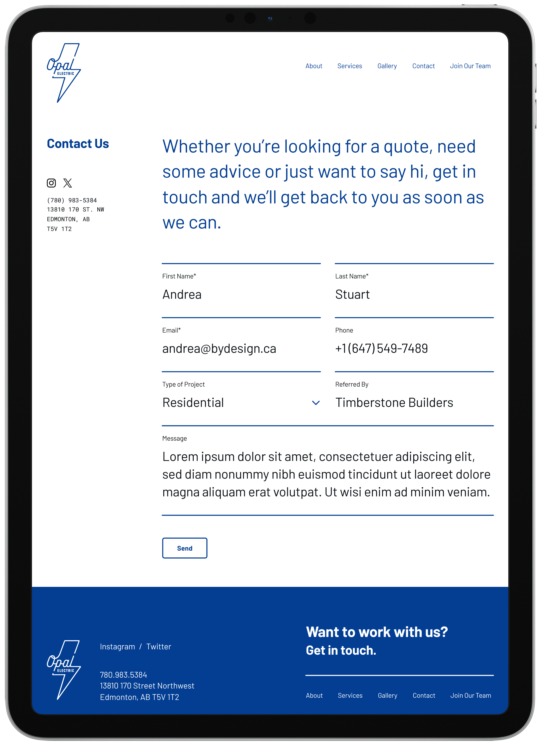
Have a look around, then submit a message via the Contact page.
HOW EASY
TO COMPLETE
4.8 / 5
1 = HARD / 5 = easyChange is Good
Based on the usability testing feedback, I determined that the lines on the Contact form could confuse some users on where the text field was. By changing the position of the lines to underneath the text, I was able to add clarity and reduce friction for the user.