Maybie
Helping discerning online shoppers to get organized in order to feel confident in their purchasing decisions.
WHAT I DID
end-to-end app design
user research
user testing
ux/ui
Branding
Choices, choices & more choices.
PROJECT CONTEXT
With over 20% of retail purchases happening online* (and that number projected to grow in the coming years) ensuring a seamless, user friendly e-commerce experience has never been more important – or valued.
But with every brand under the sun now available to shop online, how can users be expected to keep track of and manage all the items they’ve viewed, liked, or wish to purchase?
*Source: Forbes Advisor
You like some, you lose some.
THE PROBLEM
It can get overwhelming for users to keep track of and save the items they’re considering buying, leading many users to employ a frustrating and inefficient mishmash of ways to help solve this problem.


Understanding the Overwhelm
THE GOAL
I set out to find ways of helping discerning online shoppers to better organize and keep track of potential purchases, in order to help them feel informed of their options and confident in their buying decisions.
RESEARCH OBJECTIVE #1
How are users finding items they wish to purchase online?
RESEARCH OBJECTIVE #2
What does a user’s online shopping “workflow” look like?
RESEARCH OBJECTIVE #3
What features do users look for, and what are some common pain points while shopping online?
In order to ensure that both the research and any proposed solutions were firmly aligned with the users’ needs, I created a persona that captured the goals of our discerning online shopper. Having their current challenges highlighted helped to keep ideas and development firmly targeted towards their needs.
Who are we helping?
PERSONAS

THE APPROACH
Research Methods
After conducting some initial informal interviews and validating the problem, I studied the competitive landscape to gain a sense of how others are (or aren’t) solving users’ issues in this space.
Methods Used:
Competitor Analysis
User Interviews
User Survey
Affinity Mapping
1. Competitor Analysis
After identifying the user persona, I then crafted a research plan in order to determine the best approach for gathering insights. I chose to employ a combination of research methods in order to maximize my understanding and ability to empathize with the user, and to gather valuable insights.

2. User Interviews
Next, it was time to talk to real users to gain a deeper understanding of their needs and goals, and of how they were currently trying to accomplish them. The insights gained from these interviews was invaluable in learning about individual users’ behaviour, and in helping me to empathize with the challenges they were facing.
INTERVIEWEE 1
“I prefer online shopping, because I love to window shop! I like to look at tons of options before I buy.”
-julie, browsing loverINTERVIEWEE 2
“I hate when I get advertised something cool on Instagram, but then can’t find it when I want to come back to it.”
-kathryn, casual online shopperINTERVIEWEE 4
“I love browsing Pinterest for inspiration at beginning of shopping for something, but I never click those links…they never seem to be go to real online stores.”
-Symone, "power shopper"INTERVIEWEE 3
“Sometimes I’ll leave my tabs open, sometimes I’ll screenshot things…honestly my bookmarking system is a bit of a mess.”
-ruth, casual online shopper3. User Survey
After conducting my user interviews, I felt it would be useful to ask a few additional questions based off of my initial findings. By using a survey with screener questions, I was able to specifically target optimal users and further validate my interview insights.


The results most users did not have a consistent way of saving items, rather using a combination of methods. In the absence of a solid alternative, many users simply preferred to leave tabs open in their browser as a form of bookmarking.
4. Affinity Mapping
After completing the user interviews, I analyzed the transcripts and made note of each user’s unique insights and goals, in order to find patterns in what they were experiencing and/or looking for.
From this exercise, I was able to identify 5 key areas that were common among all interviewees:
Emotional drivers
Key factors in determining purchases
Most-frequented websites/tools
Workflows that work for the user (reduce friction)
Workflows that could be improved


How Might We’s
Finally, before moving into ideation, I distilled all of my research data and insights into a succinct HMW statement. Much like the persona, this statement would serve to anchor any proposed solutions in the key problems my users were facing.
HMW STATEMENT
How might we help discriminating online shoppers to better organize and keep track of potential purchases in order to help them feel informed of their options and confident in their purchasing decisions?
THE SOLUTION
Ideating
Armed with a solid understanding of my users and the problem they needed to solve, it was time to start ideating on potential solutions. I used various idea generation techniques to come up with possible solutions.

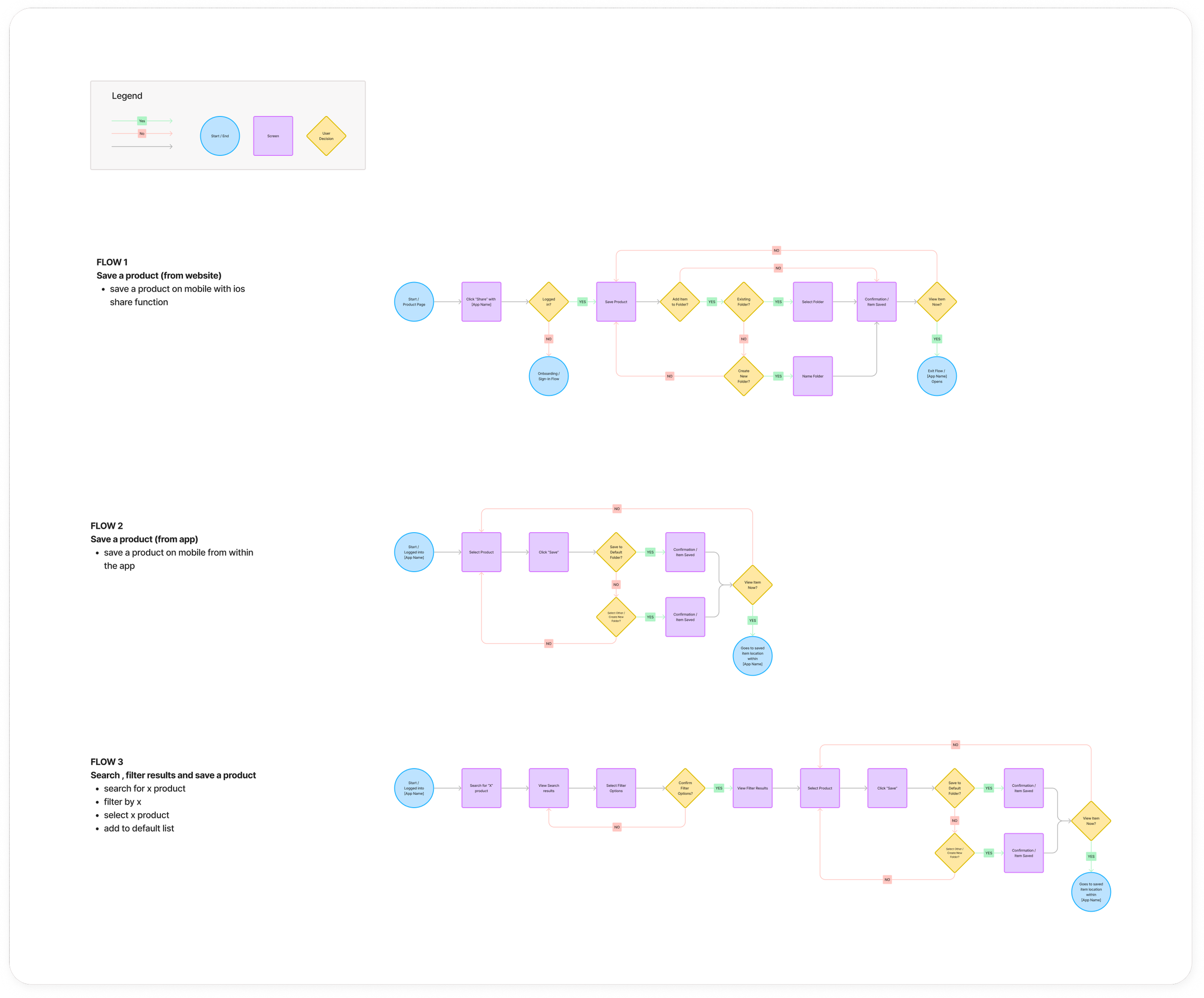
User Flows
Next, I continued to flesh out the user journey by sketching both User and Task Flows for several different potential tasks the user may try to accomplish. Doing this helped decide which tasks to prioritize when it came time to start sketching low-fidelity wireframes.
Lo-Fi Wireframes
Having decided to start by designing the booking flow, I sketched out several iterations for how each screen could look and function before moving on to mid and finally high-fidelity wireframes.

Creating an Identity
BRANDING
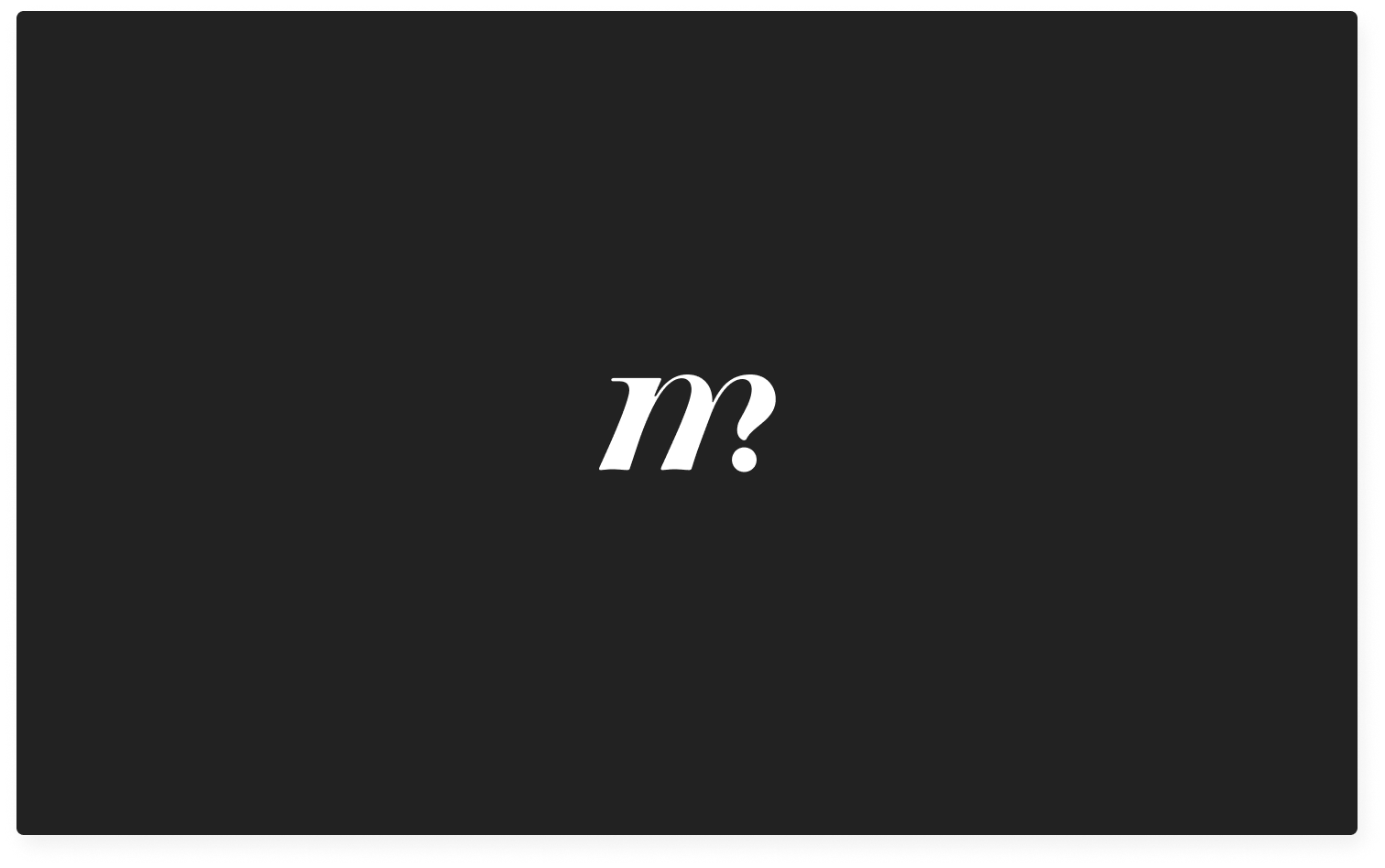
After drafting an exhaustive list of potential names, I settled on Maybie as the perfect playful way to capture the main goal of the app – to mark items as potential “maybe” purchases.

The sans-serif wordmark is refined without taking itself too seriously, while the icon is a subtle nod to a question mark woven into the serif “m”. I paired a bright, energetic colour paired with clean, neutral tones in order to maximize the branding’s impact, without distracting from the products themselves.


Time to Test
USER TESTING
Next, it was time to test the prototype with real users to see what was working, and what could be improved upon.
Users were asked to complete 3 tasks:
TASK #1
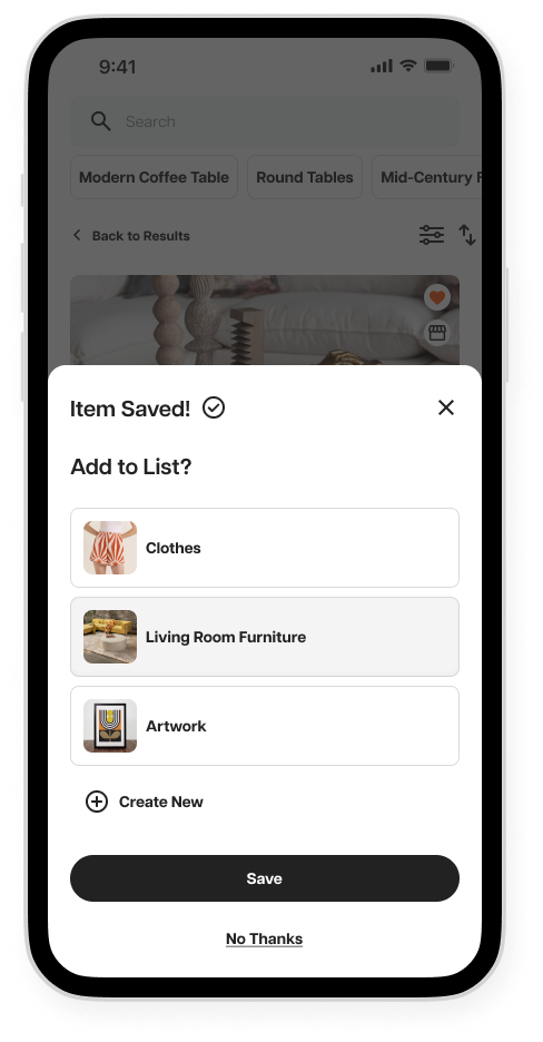
Search for an item, use the filter options, and save an item to a list.
TASK #2
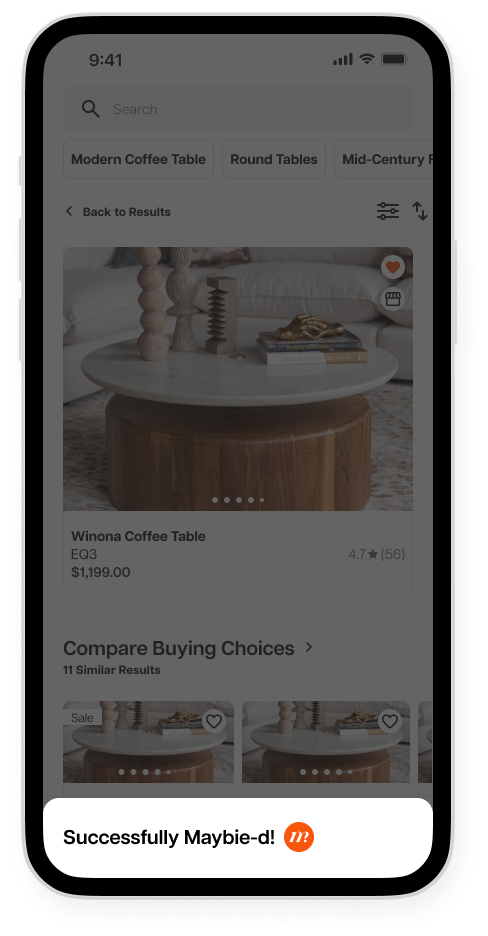
Save an item from a website via the browser extension.
TASK #3
Navigate to notifications and view product updates.
Task #1
Search for an item, use the filter options, and save an item to a list.
The Results
SUCCESS
RATE
100%
from 6 partiCIpantsHOW EASY
TO COMPLETE
4.67 / 5
1 = HARD / 5 = easyAll users were able to successfully complete the task.
All users were able to easily navigate and find the information required.

Some users interpreted the coloured “heart” icon as its inactive state, which caused some confusion on screens where items were already meant to be “favourited”.
Task #2
Save an item from a website via the browser extension.
SUCCESS
RATE
100%
from 6 partiCIpantsHOW EASY
TO COMPLETE
4 / 5
1 = HARD / 5 = easyAll users were able to successfully complete the task.
Not all users found it obvious how to begin the task (e.g. click the browser extension).

Users reported no issues in completing this task.
Task #3
Navigate to notifications and view product updates.
SUCCESS
RATE
100%
from 6 partiCIpantsHOW EASY
TO COMPLETE
4.67 / 5
1 = HARD / 5 = easyAll users were able to successfully complete the task.
All users were able to easily navigate and find the information required.

The issue of the active/inactive icon state came up again, indicating more clarity needed to distinguish between the 2.
A little change goes a long way.
Based on the feedback received, I was able to make changes to the heart icon, which made it much clearer to distinguish between active and inactive states.


Final Protoype
After making that iteration, I was able to finalize the protoype for potential development.
Final Screens
View the prototype for the mobile app and browser extension.